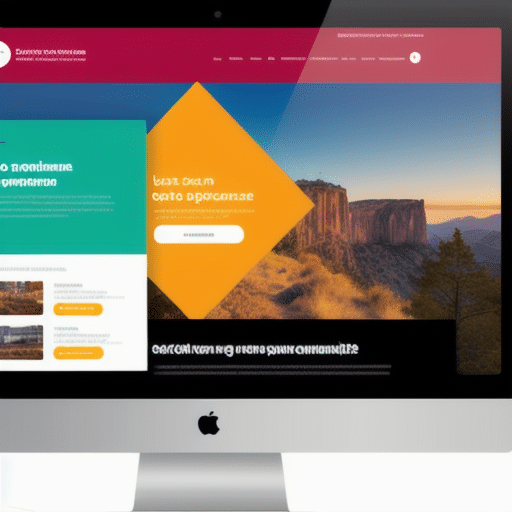
El diseño responsive se ha convertido en una práctica esencial en el desarrollo de sitios web modernos.
Con el creciente uso de dispositivos móviles y la necesidad de una experiencia de usuario fluida, los diseñadores y desarrolladores deben asegurarse de que sus sitios web sean compatibles con una amplia variedad de tamaños y tipos de pantalla.
En este artículo, exploraremos qué es el diseño responsive y por qué es importante, los beneficios que puede aportar a tu sitio web, cómo crear un diseño efectivo y algunos errores comunes a evitar.
También discutiremos cómo el diseño responsive puede mejorar la experiencia de usuario y la importancia del mismo en términos de SEO.
Finalmente, te daremos algunas razones por las que deberías considerar un rediseño con diseño responsive
¿Qué es el diseño responsive y por qué es importante?
El diseño responsive es una técnica de diseño web que permite que un sitio se adapte a diferentes tamaños de pantalla, resoluciones y dispositivos.
Esto significa que la página web puede ser vista de manera óptima desde cualquier dispositivo, ya sea un ordenador de escritorio, una tablet o un smartphone.
Es importante porque hoy en día, más personas utilizan dispositivos móviles para navegar por Internet.
Si tu sitio no está optimizado para estos dispositivos, los visitantes tendrán dificultades para navegar y encontrar lo que buscan, lo que resultará en una mala experiencia de usuario y una alta tasa de rebote.
Además, Google ha anunciado que el diseño responsive es un factor importante en su algoritmo de búsqueda, lo que significa que los sitios con un diseño responsive tienen más posibilidades de aparecer en los primeros resultados de búsqueda.
También hay beneficios para el mantenimiento del sitio web, ya que solo se necesita actualizar una versión del sitio en lugar de varias para cada tipo de dispositivo.
En resumen, el diseño responsive es importante porque mejora la experiencia del usuario, aumenta la visibilidad en los motores de búsqueda y facilita el mantenimiento del sitio web
Beneficios del diseño responsive para tu sitio web
Uno de los principales beneficios del diseño responsive para tu sitio web es que ofrece una experiencia de usuario consistente en todos los dispositivos.
Con un diseño responsive, el contenido se adapta automáticamente al tamaño de pantalla del dispositivo en el que se visualiza, lo que significa que los usuarios pueden acceder a tu sitio web desde cualquier lugar y en cualquier momento sin comprometer la calidad de la experiencia.
Además, un diseño responsive también puede ayudar a aumentar el tiempo de permanencia del usuario en tu sitio web.
Si los usuarios tienen una buena experiencia en tu sitio web, es más probable que se queden más tiempo y exploren más páginas.
Otro beneficio importante es que el diseño responsive puede mejorar la velocidad de carga de tu sitio web en dispositivos móviles.
Como resultado, tu sitio web será más fácil de usar y navegar en dispositivos móviles, lo que a su vez puede aumentar las conversiones y ventas.
Por último, pero no menos importante, un diseño responsive también puede mejorar tu presencia en línea y hacer que tu sitio web sea más fácil de encontrar a través de los motores de búsqueda.
Con un diseño responsive, tu sitio web será más accesible para los usuarios móviles, lo que puede mejorar tu posicionamiento en los resultados de búsqueda móvil y aumentar el tráfico a tu sitio web.
En general, los beneficios del diseño responsive son claros: una mejor experiencia de usuario, mayores conversiones y ventas, y una mayor visibilidad en línea
Cómo crear un diseño responsive efectivo
Para crear un diseño responsive efectivo, es importante seguir ciertas pautas.
En primer lugar, es fundamental diseñar pensando en dispositivos móviles, ya que son los más utilizados actualmente para acceder a internet.
Además, se debe tener en cuenta la velocidad de carga de la página, ya que los usuarios suelen abandonar sitios web lentos.
Para lograr una carga rápida, se pueden utilizar imágenes optimizadas y reducir el tamaño de los archivos.
Otro aspecto importante es la navegación intuitiva y sencilla.
Se recomienda utilizar menús desplegables y botones grandes para facilitar el acceso a las diferentes secciones del sitio web.
Asimismo, se deben evitar elementos que no sean compatibles con dispositivos móviles, como Flash o pop-ups.
Es fundamental que el diseño sea coherente en todas las plataformas y dispositivos, por lo que se debe prestar atención a los detalles y la estética general del sitio web.
Por último, es recomendable realizar pruebas de usabilidad en diferentes dispositivos y resoluciones para asegurarse de que el diseño responsive funciona correctamente en todas las situaciones.
Siguiendo estas pautas, se puede crear un diseño responsive efectivo que ofrezca una experiencia satisfactoria al usuario en cualquier dispositivo
Errores comunes a evitar en el diseño responsive
Uno de los errores más comunes en el diseño responsive es no considerar la velocidad de carga.
Los sitios web con un diseño responsive a menudo incluyen imágenes y videos que pueden afectar negativamente el tiempo de carga.
Es importante optimizar todas las imágenes y utilizar herramientas de compresión para garantizar que el sitio web se cargue rápidamente en todos los dispositivos.
Otro error común es la falta de pruebas en múltiples dispositivos.
A menudo, los diseñadores prueban el sitio web en un solo dispositivo y no tienen en cuenta las diferencias en tamaño de pantalla, resolución y capacidad de procesamiento entre dispositivos.
Es fundamental realizar pruebas en una amplia variedad de dispositivos para garantizar que el sitio web se vea y funcione correctamente en todos ellos.
Además, otro error es no tener en cuenta la navegación móvil.
Los usuarios móviles tienden a navegar de manera diferente a los usuarios de escritorio, por lo que es importante tener una navegación clara y fácil de usar para dispositivos móviles.
Los botones deben ser lo suficientemente grandes para ser tocados con los dedos y los menús deben ser simplificados para facilitar la navegación.
Finalmente, otro error común es no tener en cuenta el contenido que se muestra en diferentes tamaños de pantalla.
Algunos elementos pueden verse bien en una pantalla grande, pero pueden ser difíciles de leer o entender en una pantalla pequeña.
Es importante asegurarse de que todo el contenido sea legible y fácil de entender en todos los tamaños de pantalla para garantizar una experiencia de usuario óptima
Cómo el diseño responsive puede mejorar la experiencia de usuario
El diseño responsive es una técnica de diseño web que permite que un sitio web se adapte a diferentes dispositivos y tamaños de pantalla.
Al utilizar esta técnica, los diseñadores pueden crear sitios web que sean fáciles de usar y que ofrezcan una experiencia de usuario óptima en todos los dispositivos.
Una de las principales ventajas del diseño responsive es que mejora la experiencia del usuario.
Los sitios web que utilizan diseño responsive se cargan más rápido y son más fáciles de navegar en dispositivos móviles.
Esto significa que los usuarios pueden acceder al contenido del sitio web desde cualquier lugar y en cualquier momento, lo que aumenta la satisfacción del usuario.
Además, el diseño responsive también puede mejorar la legibilidad del contenido, ya que el texto y las imágenes se ajustan automáticamente al tamaño de la pantalla.
Esto hace que sea más fácil leer el contenido en dispositivos móviles, lo que mejora aún más la experiencia del usuario.
En resumen, el diseño responsive es una técnica de diseño web esencial para mejorar la experiencia del usuario en cualquier dispositivo.
Si deseas ofrecer a tus usuarios una experiencia de usuario óptima y mejorar la accesibilidad de tu sitio web, debes considerar el uso del diseño responsive
La importancia del diseño responsive en el SEO
La importancia del diseño responsive en el SEO radica en que los motores de búsqueda, como Google, han cambiado sus algoritmos para favorecer a las páginas web que ofrecen una buena experiencia de usuario en dispositivos móviles.
Si tu sitio web no está optimizado para ser visualizado en smartphones o tablets, es muy probable que pierdas posicionamiento en los resultados de búsqueda.
Además, un diseño responsive mejora la velocidad de carga y reduce el porcentaje de rebote, lo que también influye positivamente en el posicionamiento orgánico.
Por otro lado, un diseño responsive también facilita la gestión del sitio web desde un punto de vista SEO.
Al tener una sola URL para todos los dispositivos, se evita la duplicación de contenido y se simplifica la estructura del sitio.
Esto hace que sea más fácil indexar y rastrear las páginas por parte de los motores de búsqueda.
En resumen, tener un diseño responsive no solo mejora la experiencia del usuario, sino que también tiene un impacto directo en el posicionamiento orgánico del sitio web.
Por lo tanto, si quieres mejorar tu SEO y mantener o aumentar tu visibilidad en línea, es esencial que consideres un rediseño con diseño responsive para tu sitio web
¿Por qué deberías considerar un rediseño con diseño responsive?
Si tienes un sitio web, es probable que hayas escuchado sobre el diseño responsive.
En pocas palabras, se trata de una técnica de diseño web que permite que tu sitio se adapte a cualquier dispositivo en el que se visualice, ya sea una computadora de escritorio, una tablet o un teléfono móvil.
Pero ¿por qué deberías considerar un rediseño con diseño responsive? La respuesta es simple: porque cada vez más personas navegan por internet desde sus dispositivos móviles.
De hecho, según un informe reciente de Statista, el tráfico móvil en internet representó el 54,8% del total en todo el mundo en 2021.
Si tu sitio web no está optimizado para dispositivos móviles, estás perdiendo una gran cantidad de visitantes potenciales y, por lo tanto, oportunidades de negocio.
Además, Google ha dejado claro que prefiere los sitios web con diseño responsive y los posiciona mejor en los resultados de búsqueda.
Un rediseño con diseño responsive también puede mejorar la velocidad de carga de tu sitio web y la experiencia de usuario, lo que a su vez puede aumentar el tiempo que los visitantes pasan en tu sitio y disminuir la tasa de rebote.
En resumen, si quieres mantener tu sitio web relevante y competitivo en el mundo digital actual, deberías considerar seriamente un rediseño con diseño responsive
En el mundo actual, en el que cada vez más personas utilizan dispositivos móviles para navegar por la web, el diseño responsive se ha convertido en una necesidad.
Como hemos visto en este artículo, no solo es importante para mejorar la experiencia del usuario, sino que también puede tener un impacto significativo en el SEO y en el éxito de tu sitio web.
Aunque crear un diseño responsive efectivo puede requerir tiempo y esfuerzo, los beneficios a largo plazo son invaluables.
Si aún no has considerado un rediseño con diseño responsive, es hora de hacerlo.
Pero, como siempre, es importante recordar que el diseño responsive no lo es todo: la calidad del contenido sigue siendo fundamental para mantener a los usuarios interesados y comprometidos con tu sitio web.
¿Qué otros factores crees que son importantes para crear un sitio web exitoso?